
Mia Steventon's Website
Double Page Spread Drafts

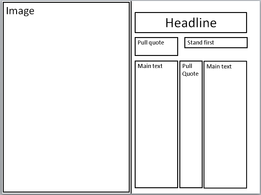


Draft One I placed my Headline, Stand first and Pull Quote at the top of my page as it allowed me space to adjust things and put my columns in when they were ready. I also added a logo of my magazine to the left-hand corner of the page.

Draft Two I added my columns and made them slightly see through in order to ensure it wouldn't hid any of the picture when I added it.

this was what I based my magazine design off of but instead of making it in colour I decided to keep it mostly back and white to create a moody atmosphere.
Draft One I placed my Headline, Stand first and Pull Quote at the top of my page as it allowed me space to adjust things and put my columns in when they were ready. I also added a logo of my magazine to the left-hand corner of the page.
Contact Sheet
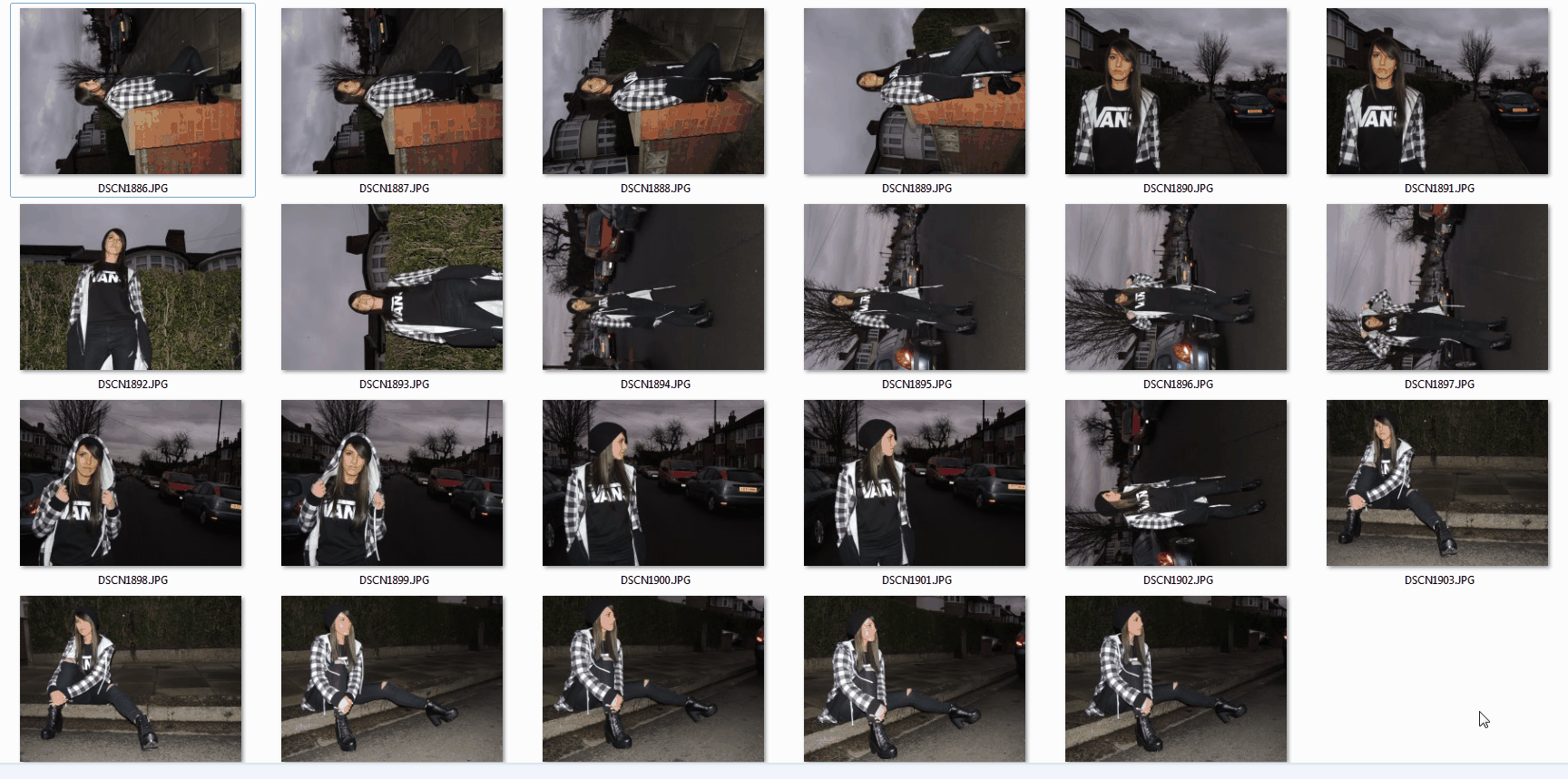
These were the photos I took of my model - Jodie. I like the fact that the background in these photos is of either the street or houses due to the fact it gives them a rustic and spontaneous look. As well as the background, I like the lighting of the photos as it’s quite dark and makes the photos look sullen; this is the type of mood I wanted to project from my character. I as feel as if the darkness of the photos work well with the colour scheme of my magazine – mostly greys, blacks and white.
My Favorite Pictures
 |  |  |
|---|---|---|
 |  |  |
 |  |  |
 | |
Conents Page Progress


This is what I based my contents page off of however I decided to make mine more structured by adding distinctive black lines and make the pictures the same size instead of a range of sizes as shown on the Q Contents Page.
Creating my Front Cover

This is my Front Cover photo before I edited it to make it black and white.


This is a front cover from Q Magazine which I planned to base my cover from, however instead of making the Masthead in colour I opted to keep it black and white in order to create sharp lines as well as keep it simplistic.
This is my Front Cover photo before I edited it to make it black and white.